Re-Introducing Peace Lord of the Red Planet

0977385124I wrote this novel in 2010. Okay, actually I wrote it probably in 2006. I did the National Novel Writing Month challenge, but I did it in June. 50,000 word in 30 days, and I produced 75% of a usable manuscript. The last four chapters were awful. So I re-wrote them completely in 2009.

I knew it would be controversial, since it deals with religion, war, peace, monogamy, polyamory, polytheism and bisexuality. It also openly mocks a lot of our more prosaic ideas of what a “god” is. I figured the religious right would hate it. Imagine my shock when I discovered that the atheist left hated it more. Apparently, not only is it beyond the comprehension of some readers that a good person can suffer from prejudice and learn better, it’s also unacceptable to a lot of them that a protagonist declare any religious belief.

Who knew?

But people hating my book did not disappoint me. If they’re angry, they’re reading. Trouble was, not enough people were angry. “Peace Lord” just didn’t get the kind of attention that my Arbiter Chronicles stories do. I suppose some would say that means it’s not as good. I can’t comment. You don’t ask a parent to pick a favorite child.

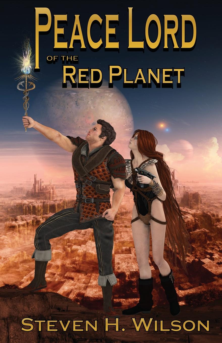
When I discovered the wonderful artist Bob Keck in the Farpoint Art Show this year, I decided to ask him to do a book cover. My son, Ethan, said, “Why don’t you have him update ‘Peace Lord?’ It’s a little dated.” I should point out that Ethan designed the cover of “Peace Lord,” and provided the cover art. I think it’s pretty brave of him to make that assessment.

So, though I’m sentimental about Ethan’s cover art, I decided to take his suggestion. I engaged Bob to bring the characters of Shep Autrey and Xhylanna of Jentana to life, and I think he did a wonderful job. This, then, if the new cover for Peace Lord of the Red Planet. It’s the tale of a Civil War era Quaker physician who, like John Carter of Mars, dies on Earth and is transported to an alien world instead of going to Heaven or Hell. He saves the life of a warrior prince and becomes a hero. Then he commits a breech of etiquette and is sentenced to death. He faces death so bravely that his hosts declare him the bravest warrior alive… all because he refuses to fight. He goes on to unseat the staid traditions of an entire world, including its gods. Along the way he abandons some of his own faith and replaces it with a new understanding of himself and the universe.

If you haven’t read it, its repackaging is a great opportunity to give it a look. If you have read it, now is a good time to recommend it to a friend. Here’s the Amazon link. Don’t worry that it shows the old cover. The new one is now the only one being produced. If by some bizarre chance Amazon dredges up an old copy, let me know, and I’ll trade you a corrected one!

The Art of Enterprise Regained

If you’re getting the impression that I’m just hopelessly stuck on myself, well, I hope you’re wrong. Can’t swear to it. It’s  just that I’ve put a lot of time and energy lately into preserving the work that a lot of people, myself included, did back in the 1970s and 1980s, and so I’m thinking of a lot to say about it. And, yeah, I think our work deserves to be remembered. So there it is, and here’s a rundown of the artistic effort that went into making my first fanzine, lo those three decades ago.

Fanzines in the 1980s had amazing artwork, not always done justice by the printing technologies fan publishers were forced to use. When I decided to publish my own zine in 1984, I wanted it to have its share of artwork. Being a one-man-show, I had to provide my own. Fortunately, in those days, illustration was something I did. I’d also worked on the school newspaper and yearbook, so I was comfortable with publication design.

For the zine’s cover, I couldn’t afford color. I was publishing on my parents’ office Xerox machine! So I xeroxed a photo of the Enterprise (I think from the STTMP Souvenir Program Book center spread), trimmed with scissors and pasted over the Starfleet Delta, which I formed with 4pt layout tape on thin graph paper:

EnterpriseRegained_illos-5

I printed it on canary yellow paper. All copies with this cover were printed at home on my parents’ office copier, and all artwork was thus reproduced from the original by Xerox.

EnterpriseRegained_Cover_1_Yellow_2I did 25-50 copies of this one, and then my parents said “enough.” If I was going to mass-produce, I needed to do it right and go to a real printer. I pulled out the phone book and, appropriately, picked Galaxy Graphics to do my offset printing. They were going to halftone all my illustrations, so I designed a new cover.

EnterpriseRegained_Cover_2_CleanedThis is a scan of the original master for the second cover. I though it was better to emphasize the people, rather than the ship, and make it clear this was a Saavik story. This master used a half-tone of my original, which was charcoal. Haven’t found that artwork yet, but hope to, as the half-tone lost some of the detail. Copies with this cover have half-tones of my original pencils on the interior. I believe 200 copies were printer. Maybe 400?

EnterpriseRegained_Cover_2_CleanedTanWhen that batch sold out, I decided the cover needed some color, so I made it tan. For this edition, to save money, I went with pen and ink for the interior illos.

And then the illos…

EnterpriseRegained_illo_001BW_Cleaned_CroppedThe first illustration I ever did of Kevin Carson (left) and Terry Metcalfe in their original Trek context. This was pencil on a page from my sketchbook. I later did a pen and ink version, tracing it on a light table. I was never as happy with that one. The smoky-looking constructs show the influence Richard Powers had on me at the time. I was so taken with his illustrations for Heinlein’s Number of the Beast.

EnterpriseRegained0203CombinedThis two-page spread of Uhura and Chekov went across the opening pages of Chapter Four. I was a little baffled when I found the box of nearly all my zine illos, and these two weren’t there. I was even more surprised when I pulled the file of master pages for this zine after all these years and found the drawings had been done right on the master pages! My art teacher, Steve Perrine, taught me better than that! But I guess I was in a hurry. There are actually three sets of masters for this thing. I first typed on 8.5 x 11 paper with NO margins, then reduced those by 70% (the Xerox only did 94, 70 and 50, I think) to create masters for copying. When I went to offset and used half-tones, yet a third set of masters had to be created with the half-tones pasted on them. These were pencil on the characters, with the views of space behind them done in charcoal for extra contrast. Again, there’s a pen and ink version.

EnterpriseRegained_Illo_4_CleanedBWI was never happy with this drawing. Again drawn directly on the masters, and the Kirk head was actually cut and pasted in place. I have a vague recollection that there was another, botched Kirk head under it. Or maybe a figure of Kirk that actually fit in the scene. As it is, I decided pretty quickly that I thought the effect was just bizarre. I still like the drawing of Saavik in her robe, though. You’ll note that all the Saavik images are based on Robin Curtis, even though the story was written and the publication almost complete before she ever played the part. I took an immediate liking to her as Saavik. I think it’s a shame that people only seem to remember Kirstie Alley now. I’ve met and worked with Robin several times over the years, and she’s a fun and friendly person.

EnterpriseRegained_illo_4B_Cleaned_CroppedSince I wasn’t happy with the first, I replaced it with this one when I went pen and ink. A dubious trade-off, I think, since this isn’t nearly as nice a drawing of Saavik!

Looking back, it’s probably a mistake that there’s no illustration of Angela Teller. I think, had there been, a lot less people would have believed I had created the character for this story. She was, after all, the same lady who appeared in the episodes “Balance of Terror,” “Shore Leave” and “Turnabout Intruder.” I just always liked her, so I put her aboard the new Enterprise.


An Unfinished Piece of Artwork

Deforest Kelley and Jane WyattRifling through old papers from college, I found several dozen illustrations I’d done for fanzines back in the day. This unfinished piece was intended for my story “Mandy,” but I ran out of time. The circa-1987 Jane Wyatt and De Kelley in the center were to be flanked by circa-1966 De at the top left and circa-1937 Jane at the bottom. (You can see just a little of where I’d sketched an oval to place her face.) I think I couldn’t find a decent publicity shot of her from Lost Horizon in those pre-Internet days, although I know one of my sketchbooks does contain a thumbnail of Jane at a young age. 47 year-old Steve is not the artist 21 year-old Steve was. My attempts to draw now usually end in frustration and anger at my failing eyes. I’d be afraid to try and finish it. But, since I’ve got the story on my site, I thought I should post the illo that might have been.